DECONSTRUCTEAM
Logo Design and Identity
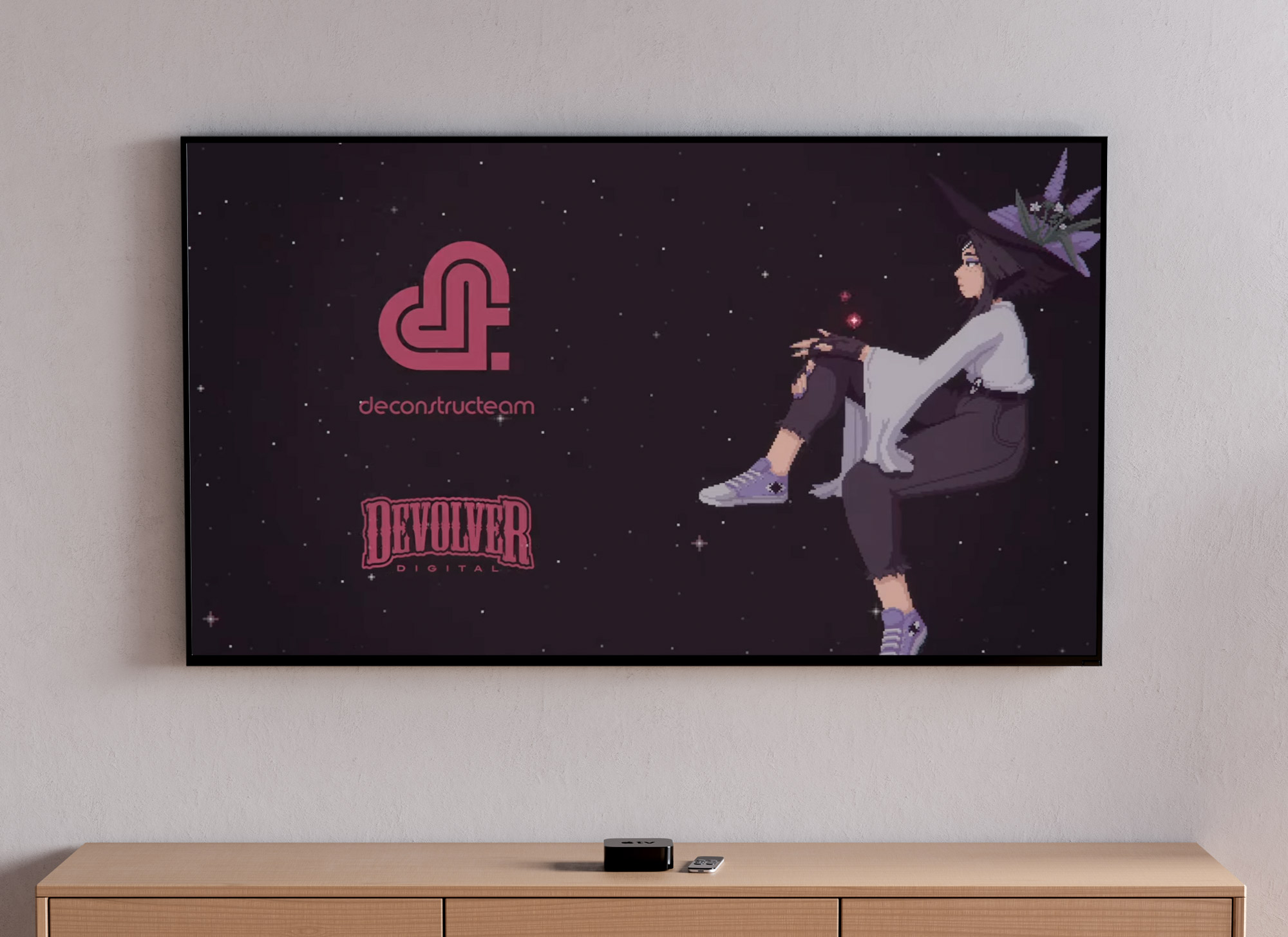
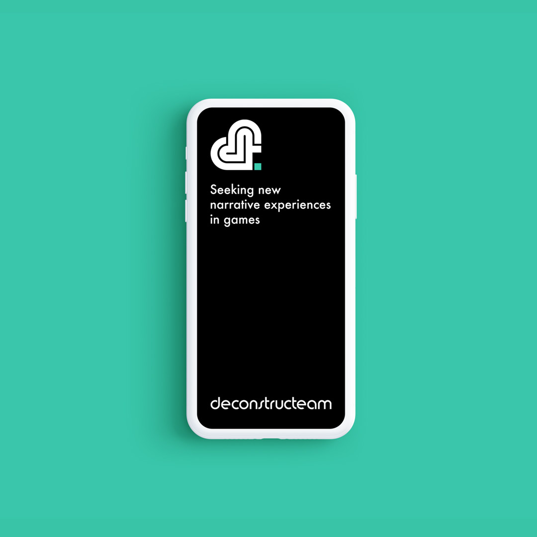
Deconstructeam is a queer studio that makes videogames with a focus on narrative experiences.
Empathy, morality and meditation on human nature are common motifs in their work, as well as representation of gender, sexuality, race, culture, and functional diversity.

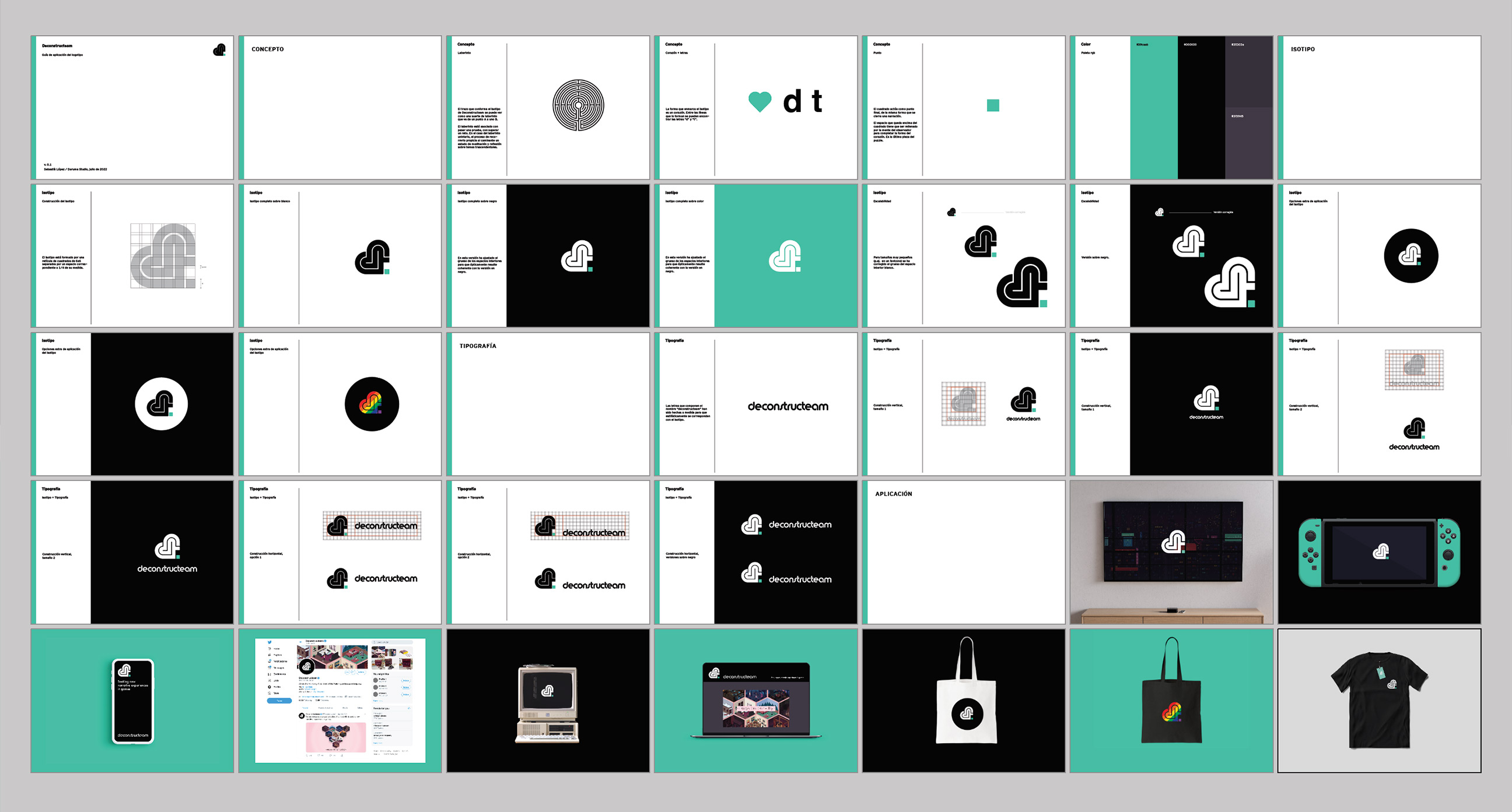
Project details + Process
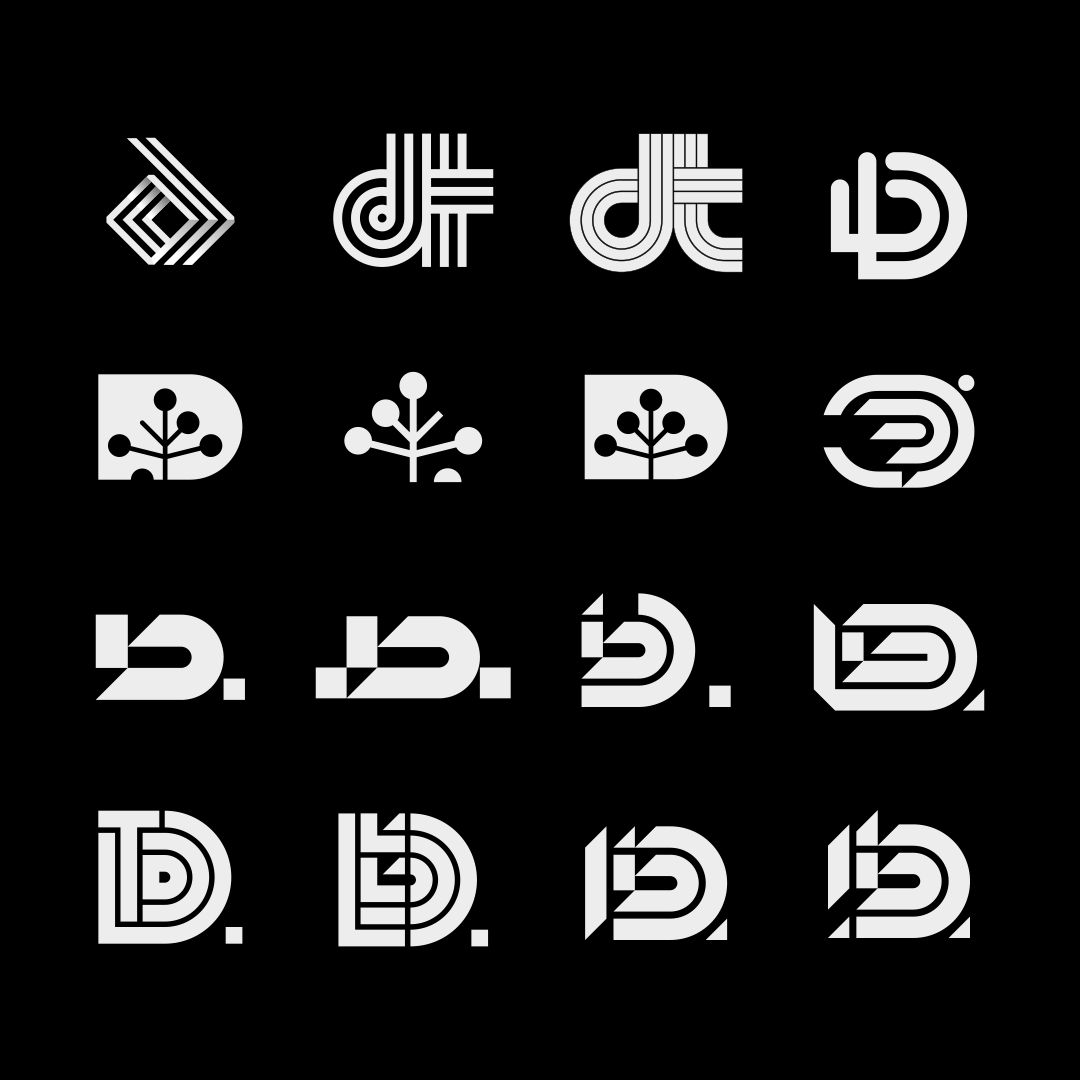
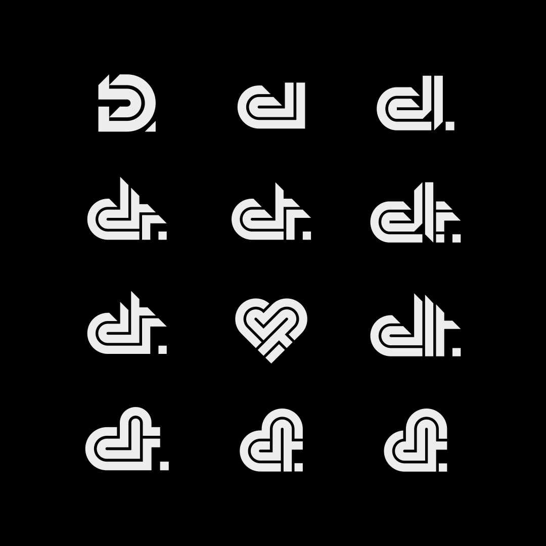
The people at Deconstructeam were so kind to provide the time, resources and constant feedback necessary to work the best way possible. The logotype was shaped carefully; many paths were explored, hand-drawn and digital sketches were tested until we arrived at the point where three factors met: the appeal of the visual aesthetic, the concepts behind the design, and the versatility of its application
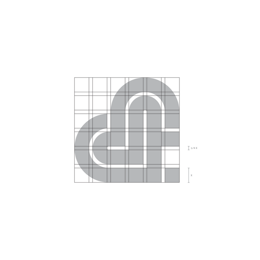
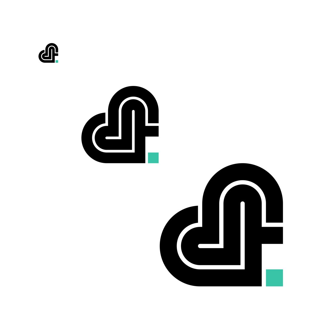
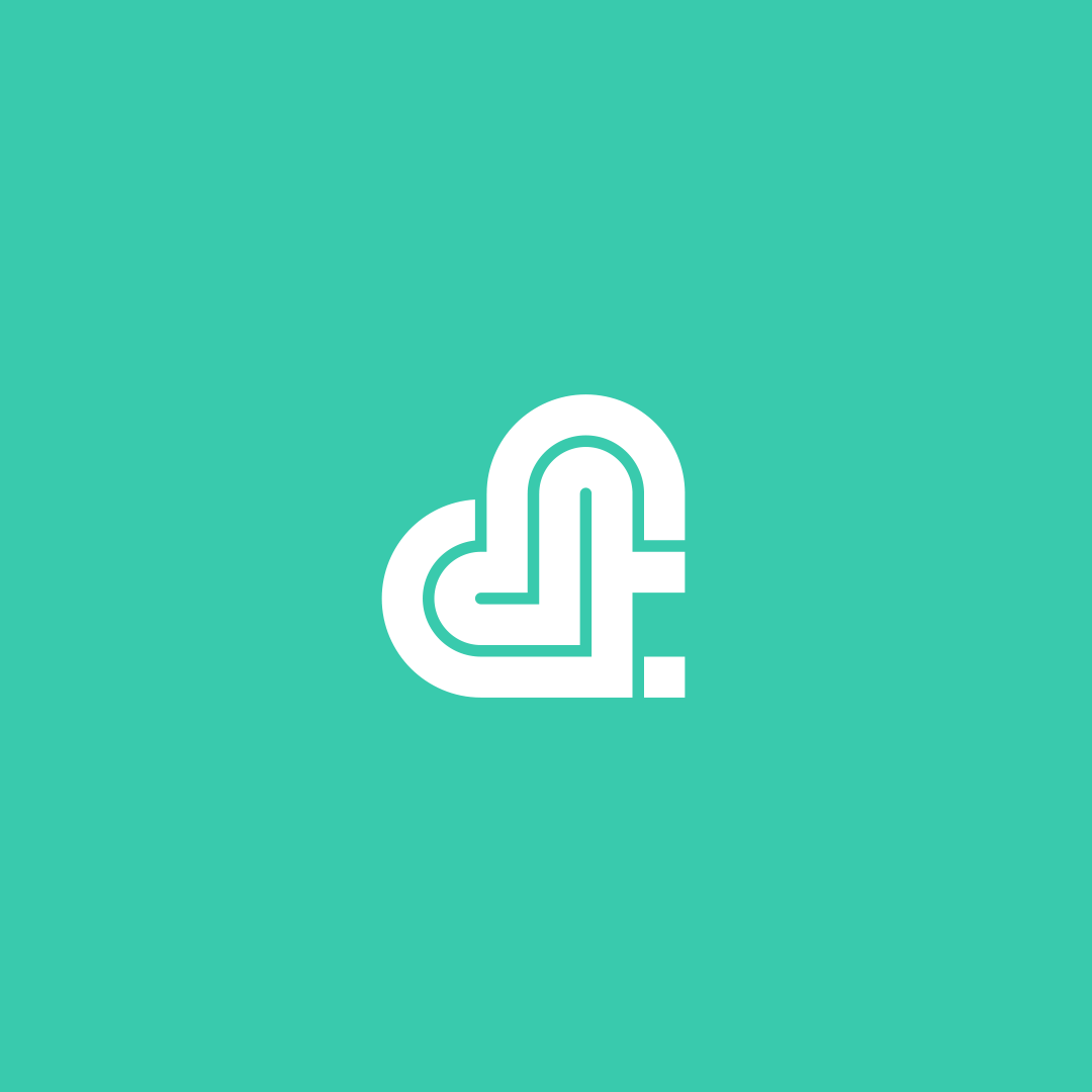
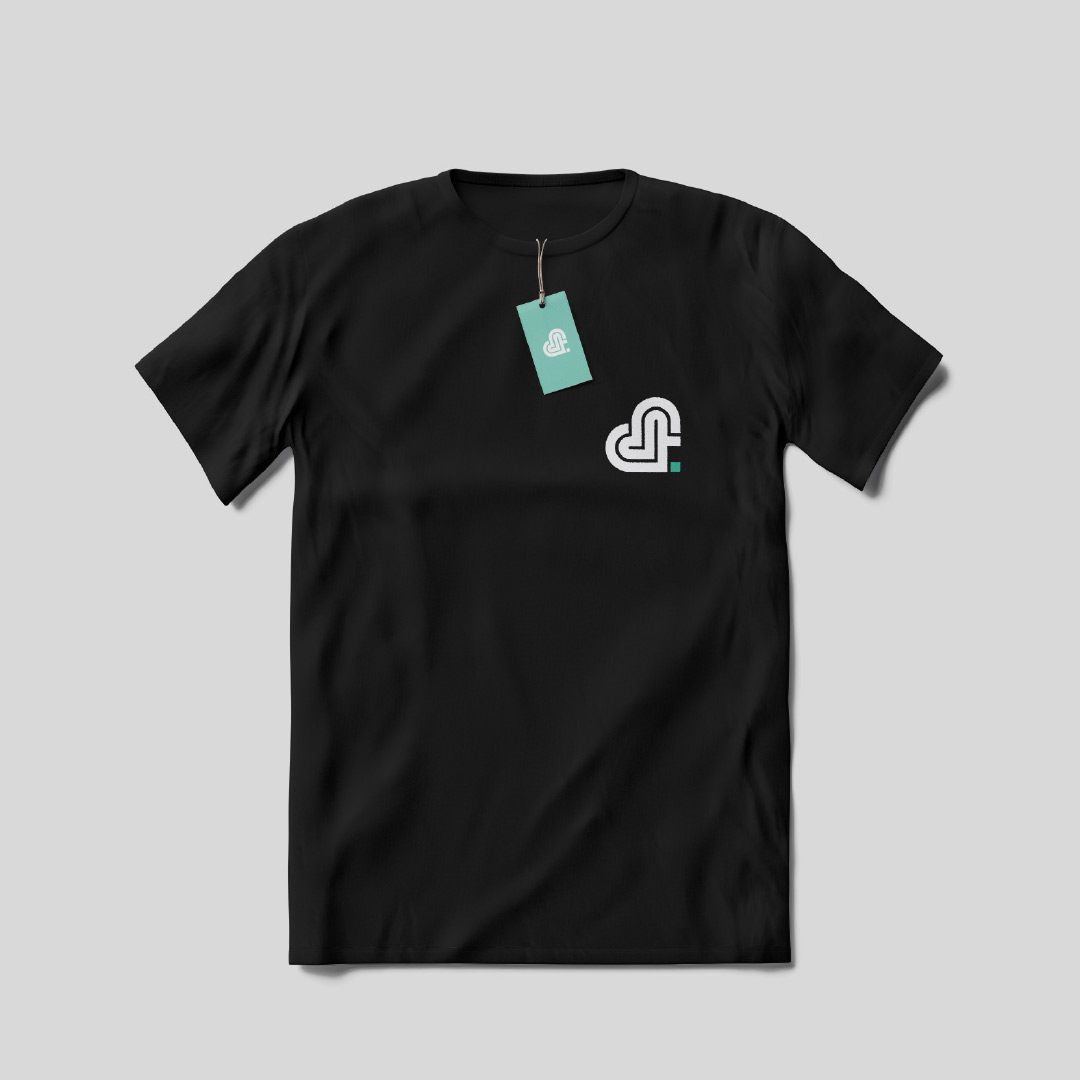
The isotype from the final design includes different concepts that represent who are Deconstrcteam and how they work:
The outline that conforms the isotype can be seen as a labyrint, which is a trial and also a path to meditate. At the same time this outline is made using the letters d and t. The shape is also a hearth. The hearth is missing a square, the last piece of a puzzle that your mind has to fill in. And the green square is an end point, the same that closes a narrative.